iContact Email Builder Design & Testing

Project Summary
The Project
Web 1.0 email marketing service provider iContact came to Viget to help redesign their entire email-builder application interface and trial user flow from scratch in just 15 weeks.
My Role
As lead UX Designer, I worked closely with developers on an architectural model and feature definition for the email-builder application, designed the responsive UI, and led weekly prototype testing with users.
The Result
Our 12-person team launched the new React email builder and onboarding flow on time and on budget, with enough time to spare for iterations from user feedback.
Product Architecture & Feature Definition
I started by aligning our team of developers with a shared vision of some key architectural concepts, informed by a competitive review and conceptual diagrams. How do modern email builder applications work? What are the core concepts involved in creating custom multicolumn email layouts? What are our shared definitions of words like "theme," "template," and "block?" Our shared vocabulary formed the foundation for discussions of feature prioritization and the sequencing of development sprints.


Examples of the kind of visual sensemaking I used to define core concepts and a shared vocabulary with the team.
UI Design & Prototyping
My designs began as wireframes and evolved into high-fidelity prototypes as a visual parts kit was developed by another designer, and as I began linking together screens with InVision.

The evolution of my design for a single application state as fidelity increased and we learned more from weekly user testing.
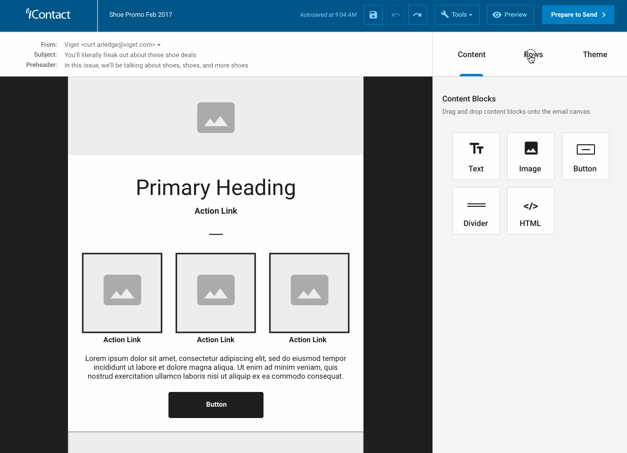
A screencapture from my InVision prototype of the email builder UI which we used for weekly user testing. The hover effects and state changes stretched the limits of InVision, but it was important to have something that felt as real as possible.
Weekly User Testing
I developed a weekly user testing program with the goal of learning as much as possible about the latest UI designs at the end of every week. This tight feedback loop allowed our team to make quick changes to the designs before our developers spent time writing code for new features. In fact, we started validating the usability of key features before we even had any completed designs by presenting users with examples from a competitor application for the first few weeks.
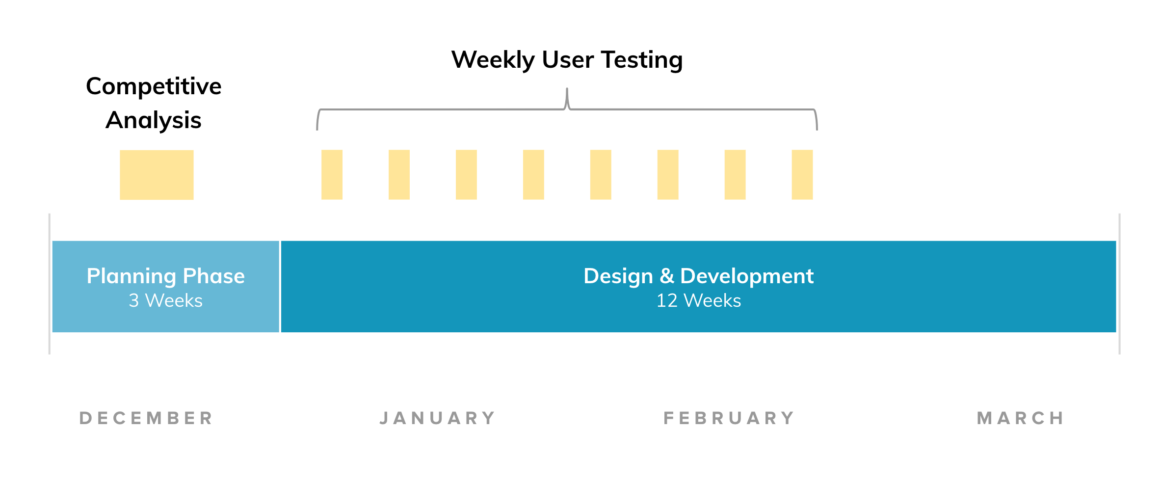

Usability tests were scheduled every Friday during the design phase. Our testing stimulus grew and evolved over the weeks as more designs were completed, culminating in a usability test with the working app in the final week.


Examples of the findings from our weekly usability testing program. User feedback had a timely and material effect on the iteration of the designs as we stayed one or two steps ahead of our develeopers.
