Visual Sensemaking
I believe in the power of using tools of visual representation to bring order to complexity and make the abstract understandable. In my work, I frequently create visual as an aid to abstract thought. I draw from both established modeling methods and bespoke formats and iterate and refine visuals to make them understandable to clients and teammates. I balance accuracy and level of detail to maximize legibility and overall usefulness for decision-making.
Included on this page
Conceptual Models
Journey Maps
Flow Diagrams
Ecosystem Maps
Conceptual Models
Below are some examples of visual representations that I created to communicate some kind of abstract concept. In most cases, the visual representation was a companion to a more literal or concrete specification.

A complex Venn Diagram that succinctly communicates audiences and their overlapping content needs for a large non-profit website.

My discovery process leads to a deep understanding of how people and processes are orchestrated to achieve business goals. I summarized my findings in this system diagram.

This diagram accompanied a recommendation to a client to create a more unified data analytics program by showing how some data exists only in one system, some in another, and some is shared.

An example of a “floor plan” diagram that uses spatial arrangement and transparency to communicate the organization of a digital information space.

I often employ simple diagrams like this one to break up text-heavy presentations.

I frequently create content models to specify content types, their attributes, and their relationships to one another. This is typical of a simplified content model diagram.
Journey Maps
Journey maps are high-density visual outputs from a significant amount of user research. In both of the examples shown, the data lends itself to a timeline-based display, but I had to design bespoke formats to make the data make sense.

A diagram I created as part of a content strategy for a philanthropic non-profit showing the donor journey mapped to business logic and existing donor communications programs.
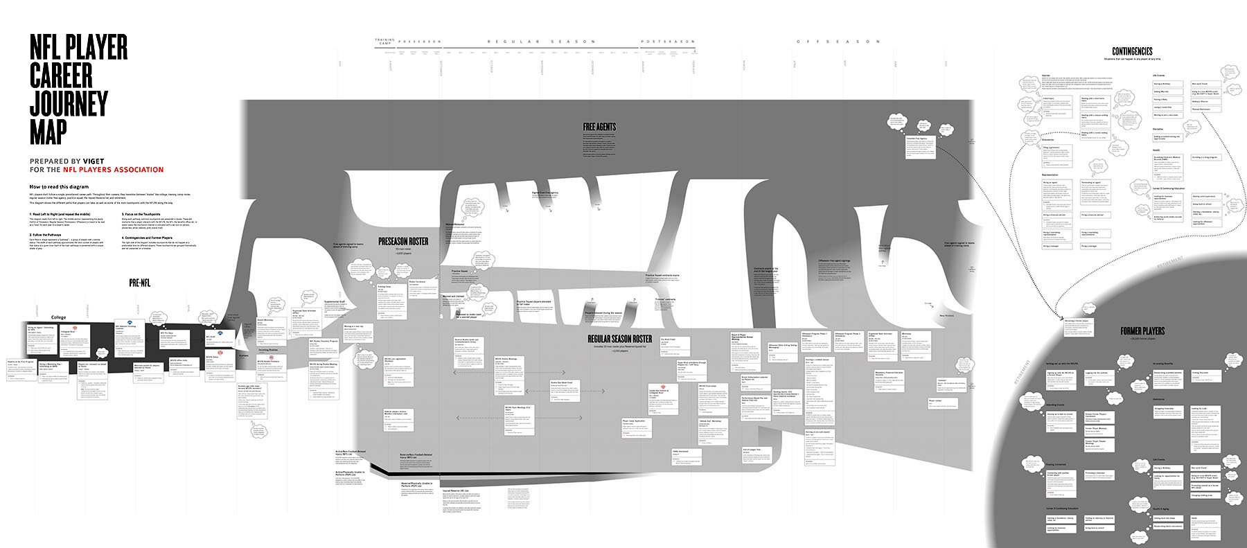
A highly complex journey map showing the branching, non-linear paths that professional NFL players may take in their careers, as well as unexpected contingencies.
User Flow Diagrams
Visualizing the possible pathways of user interaction within an interactive experience is a crucial precursor to designing interfaces. I often use Whimsical to create these kinds of diagrams.

A portion of a user flow diagram defining pathways for an at-home COVID-19 testing program. This diagram helped my team to align on a single MVP vision for the user experience and defined which screen designs would be needed.

A flow diagram I created for a new COVID-19 vaccination eligibility quiz for the State of Massachusetts
Ecosystem Maps
In recent years, I have begun creating what I call “ecosystem maps” as a visual representation of the technical and human entities behind the scenes of a client’s website or application. These diagrams are entirely bespoke and emerge as a byproduct of stakeholder interviews and audits of a client’s content and technical infrastructure.


